G-ShockArt Direction

This concept campaign for G-Shock reinterprets the brand's core idea of indestructibility through the visual language of shipping and logistics.
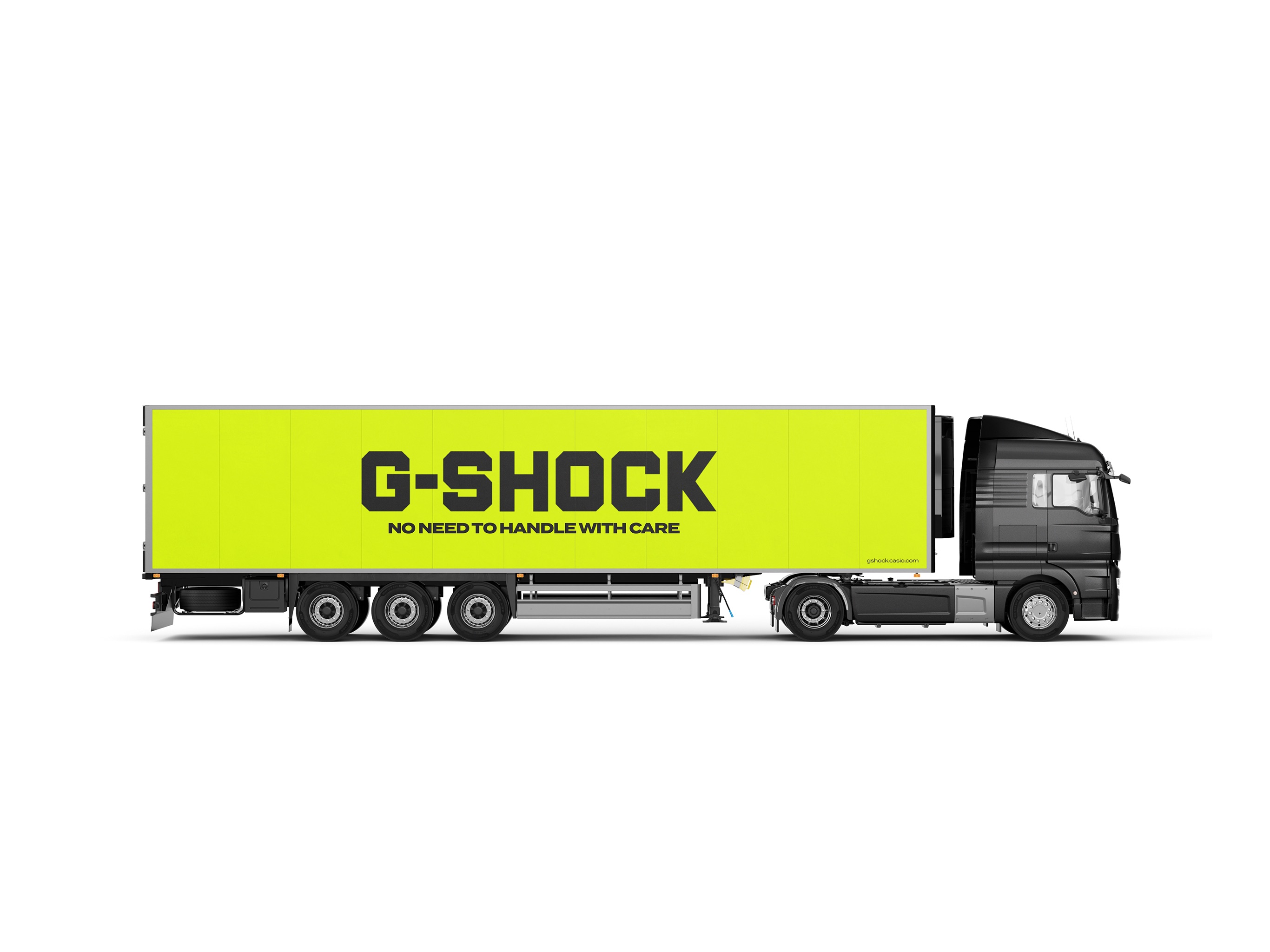
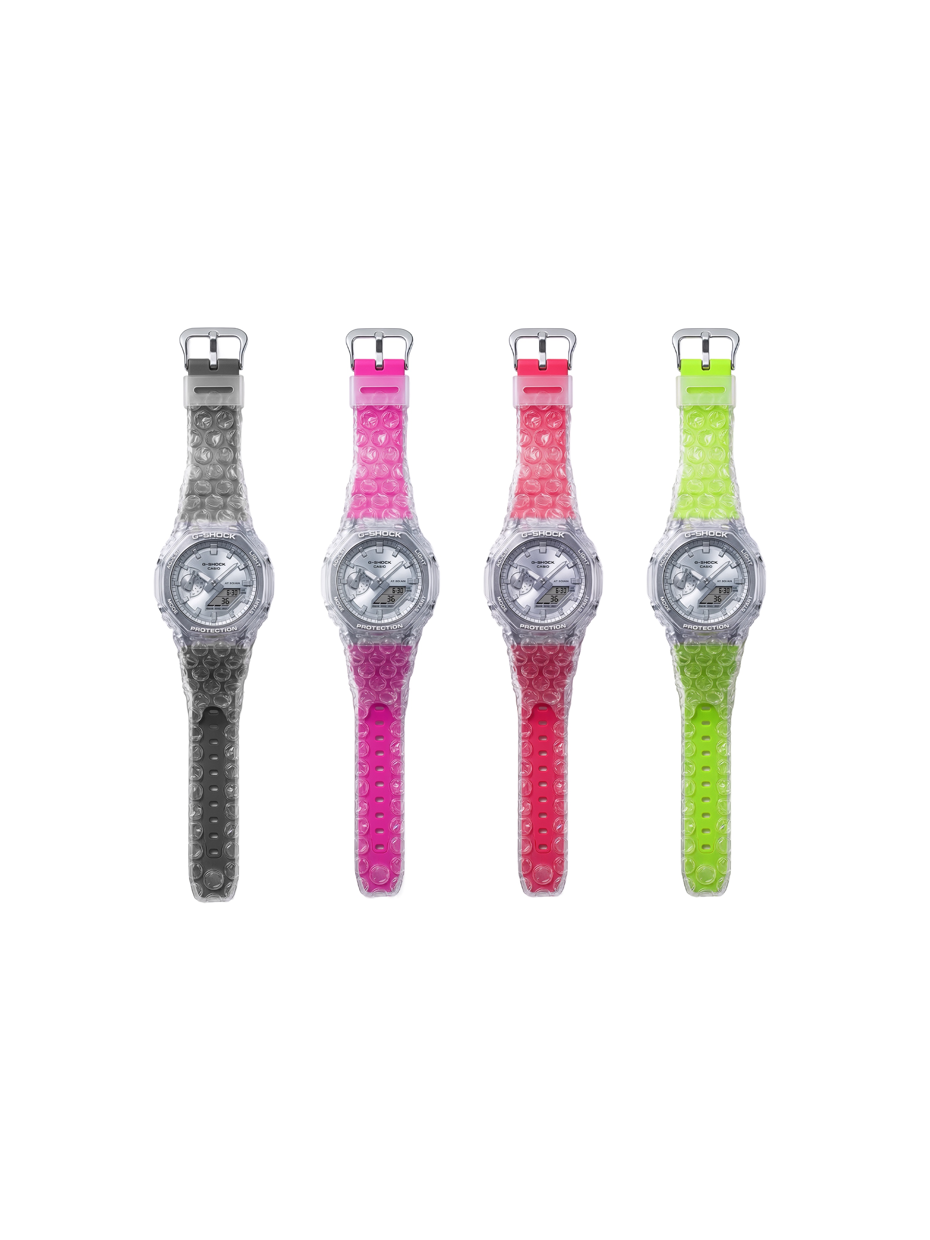
The project is built on a deliberate contradiction: a product known for extreme durability is treated as fragile cargo. Elements such as bubble wrap, packaging textures, and handling systems are used as central visual motifs, creating tension between perceived fragility and actual toughness.
By combining industrial aesthetics with exaggerated protection cues, the campaign reframes durability as something so absolute that even the idea of protection becomes ironic.
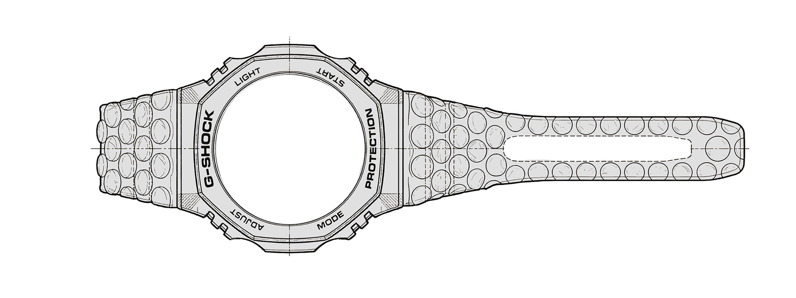
The Bubblewrap
Shock
A full art direction concept for Casio G-Shock — exploring the watch's iconic toughness through the unexpected language of bubblewrap. Product extensions, merchandise, packaging and campaign visuals.
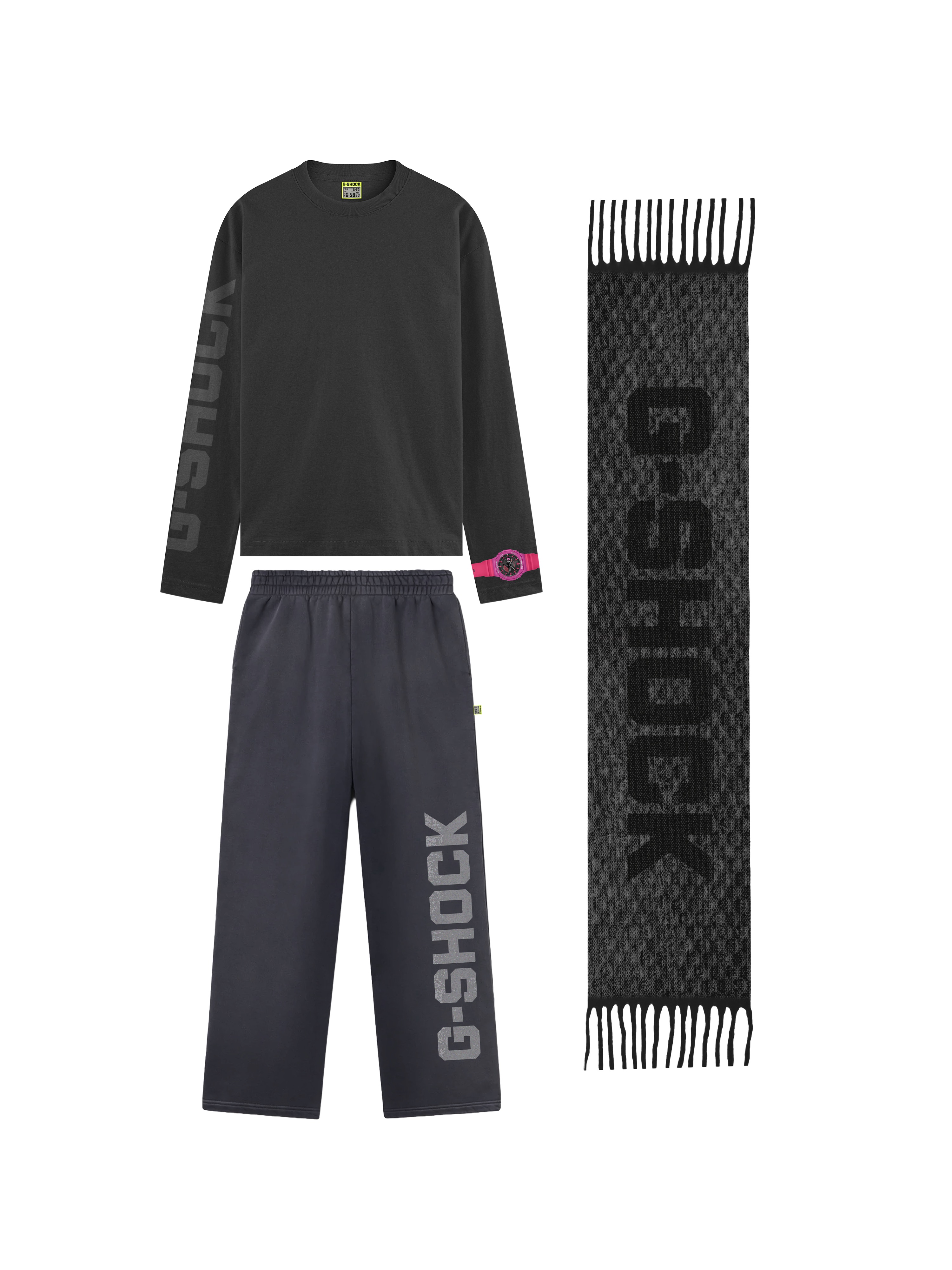
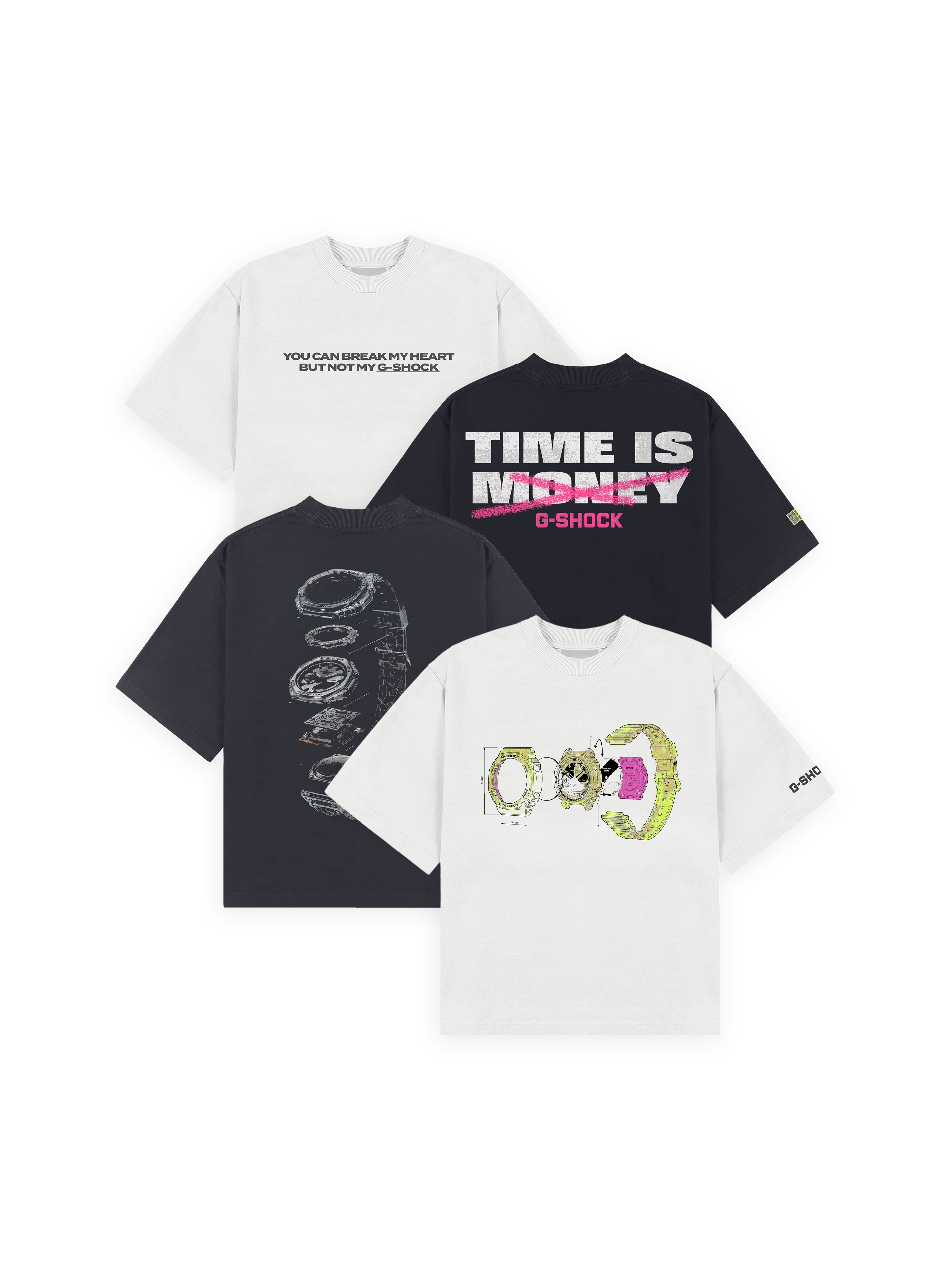
Wear the concept
Apparel and accessories extending the campaign language — graphic tees, sweats and a scarf carrying the slogans and iconography of the Bubblewrap Shock universe.
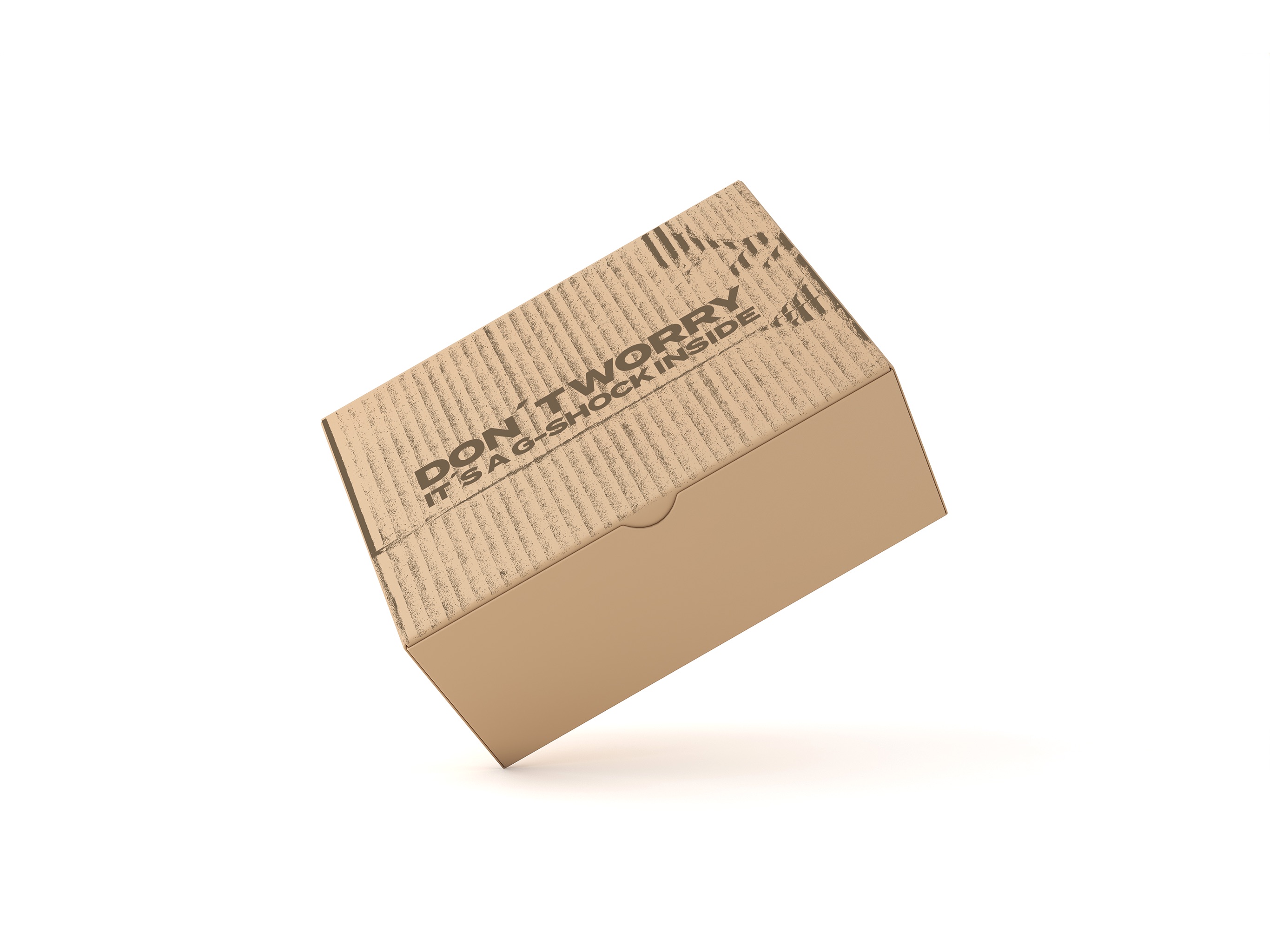
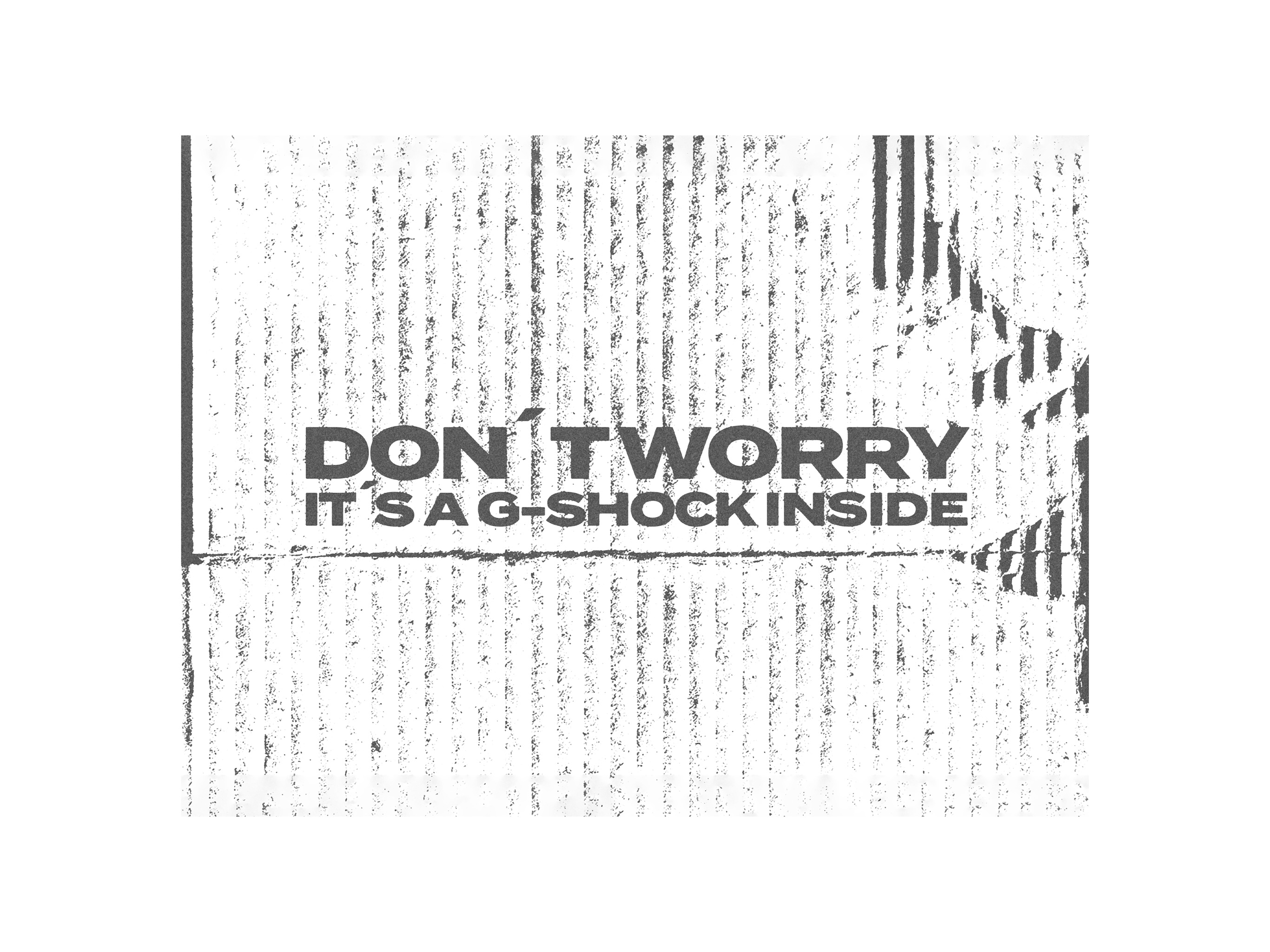
Don't worry,
it's a G-Shock inside.
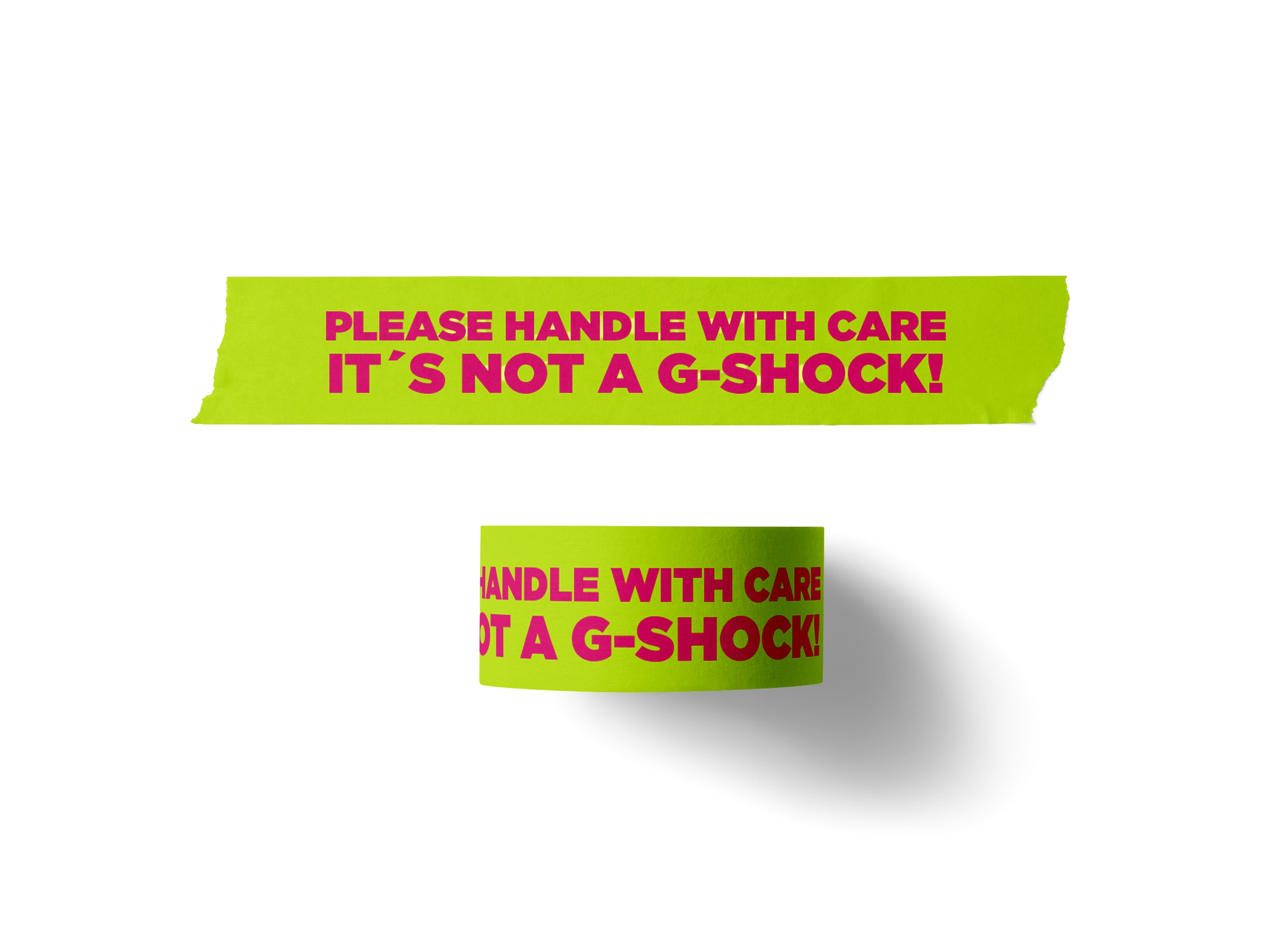
Packaging that communicates the product's toughness directly — subverting standard fragile-handling language with bold, confident copy.